
Bitcoin Analysis: Beyond the Block – July 2026
July 17, 2026
News
Today the Ainslie Research team (ainslieresearch.com) brings you the latest monthly update on Bitcoin, including the Macro fundamentals, market and on-chain technical metrics and all of the other factors currently driving its adoption and price. This summary highlights some of the key charts that were discussed and analysed by our expert panel. We encourage you to watch the video of the presentation in full https://www.youtube.com/watch?v=8KqgVGtV22M for the detailed explanations.
Bitcoin and Global Liquidity
Bitcoin is the most directly correlated asset to Global Liquidity. Trading Bitcoin can be thought of as trading the Global Liquidity Cycle, but with an adoption curve that leads to significantly higher highs and lows each cycle. As such we look to buy Bitcoin during the ‘Bust’ phase or liquidity low, then rotate out of it during ‘Late Cycle’ where liquidity is over extended and downside protection is required (our preference is to rotate into Gold). When correctly timing and structuring the rotation, it is possible to significantly outperform ongoing monetary debasement. The Bitcoin cycle low was in November 2022, and since then the returns have been unmatched by any other major asset.
Where are we currently in the Global Liquidity Cycle?
Welcome to the written report for July’s Beyond the Block. Those who also view our Beyond the Block podcast on YouTube will already know we sound a little repetitive month to month, and that is by design. Global liquidity cycles are slow moving beasts. They take quarters to turn, not weeks, and the entire game is patience while the setup builds. When it finally is time to pull the trigger on the buy, you do not need to catch the low to the day, because you get to ride the wave higher for many months on the other side of it. That is the payoff for sitting on your hands through the slow bit.
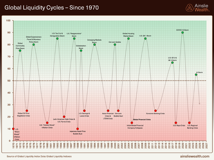
Not much has changed on the long view this month, and that is the point. Going back to 1970 the cycle still expands and contracts around the same 50 line, with each peak carrying its own narrative, the Reaganomics boom, the dot-com bubble, the QE eras, the COVID surge, and now the AI boom. The labels change, the catalysts change, but the rhythm holds. What that long history tells us is that liquidity cycles die of old age, and the current upswing has now run long enough that we should be looking for the rollover, not the next leg up.
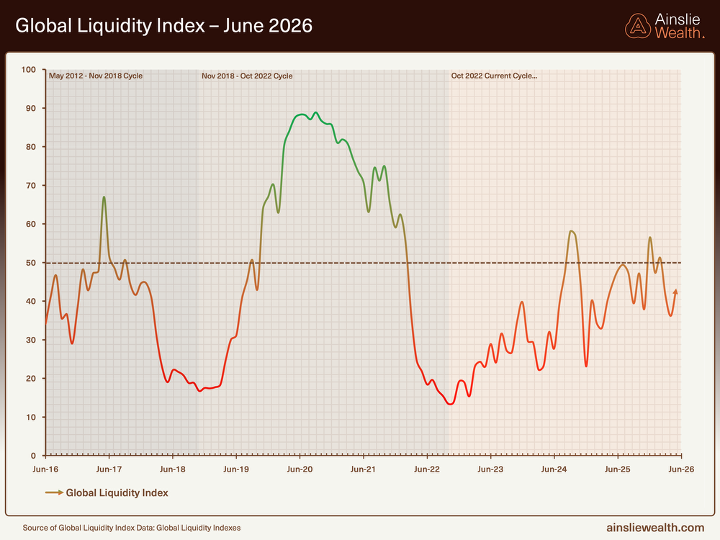
Zooming into the past decade gives us the same message at higher resolution. The monthly Global Liquidity Index has now slipped to 40.0 in the latest read, down from 45.6 last month and 57 at the last peak. That is a proper roll-over, not a wobble. Every prior turn in this series has looked exactly like this on the way down, and every one of them has been resolved lower before the next real up-leg. We are not at the bottom yet.
For context, the previous cycle bottomed near 15 in late 2022, which was the buy signal we acted on at the time. We are not pretending to know the exact level of the next trough, it may be 20 or 25 rather than 15, but the shape of the cycle has not changed. The modelling still points to a low somewhere in mid to late 2027, which is roughly in line with the 65 month bottom-to-bottom rhythm we have been tracking all year. From here the path of least resistance for the index is lower, and that is the environment we are planning around, not the one people wish we were in.
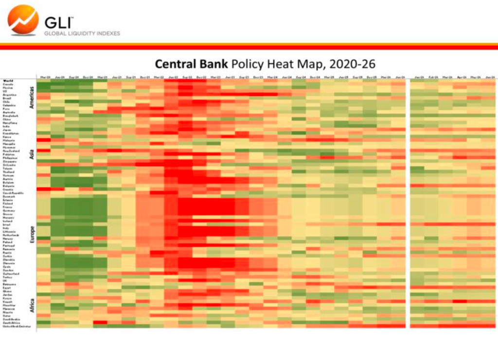
The Central Bank Policy Heat Map is worth a proper look this month because it explains why the monthly index is rolling over even while headlines look calm. Advanced Economies are almost entirely orange and yellow, which is neutral to actively tightening on a liquidity basis. The Bank of Japan sits at the very bottom of the sub-index around 26, which is a stunning result given the state of Japanese Government Bonds and the amount of intervention we would have expected by now. The US Federal Reserve sits mid pack around 46, still leaning restrictive rather than supportive.
Important context here. We are not talking about interest rate cuts when we say Advanced Economy central banks are tightening. Rates can sit still and central bank liquidity can still be draining. What matters for this map is the other side of the balance sheet, so quantitative tightening, reserve management, standing repo usage, and outright bond purchases or sales. That is where the actual liquidity gets created or destroyed. On that measure only about 16 percent of Advanced Economy central banks are easing right now, versus 61 percent in Emerging Markets. The result is a global central bank sub-index at 45.8, down from 54.7 last month, and a new player worth naming. Kevin Hard Money Walsh is being talked about as the next Fed Chair and the reference point being used is Paul Volcker. That is not the profile of someone about to flood the system. It is a policy stance that fits the map above and it is a live risk to any thesis that assumes the Fed rides in with the printer on.
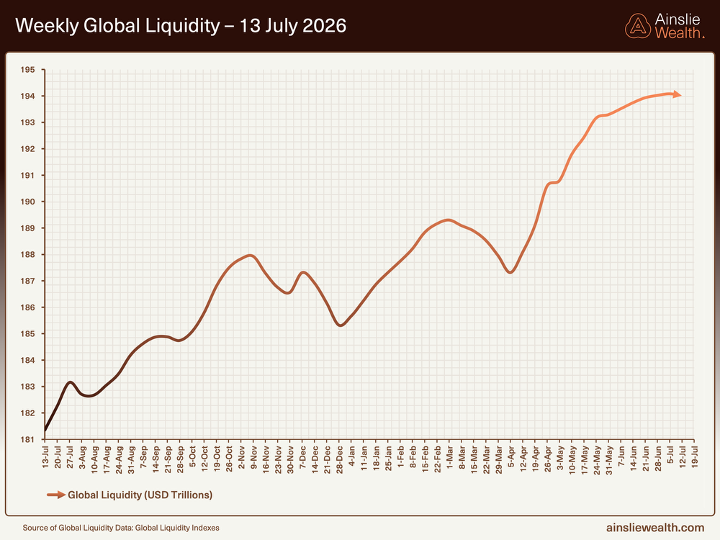
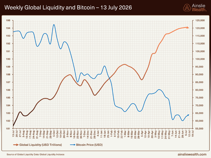
The weekly nominal series is the chart that traps people. Global liquidity just printed another fresh record at US$194.01 trillion, up from US$193.5 trillion last month, and on a 12 month basis it is still growing at 7% with a 3 month annualised rate around 13%. On the face of it that looks bullish. In reality the line is decelerating hard at the margin, and the recent modelling flags it as clearly peaking. Support is real, fresh impulse is not.
The thing to focus on is the rate of change at the margin, not the absolute level. The Shadow Monetary Base, which is the engine underneath, sits at US$109.82 trillion and is now running at minus 1.3% on a 3 month annualised basis. It has been slipping quietly for months while the headline nominal number keeps making new highs, and that is exactly the kind of divergence we care about. When the fuel is contracting and the top line is expanding, the top line is being carried by things like SLR tweaks, Treasury buybacks and volatility suppression, not organic money creation. That is a late cycle setup, not an early cycle one.
The chart to focus on here is not the nominal Global Liquidity line, it is the Global Liquidity Index and its momentum. The GLI has now rolled from 57 to 40 across three consecutive monthly prints. The weekly nominal chart looks comforting, but the GLI momentum chart is the one telling you the story, and it is telling you the same story it has been telling for three months now. Bitcoin has already done the heavy lifting on pricing in the late cycle headwinds we keep flagging, while the nominal liquidity line is yet to fully reflect them. That creates the setup where Bitcoin can grind lower or sideways for longer than most people expect, even while the top line chart keeps making new highs. If you are waiting for Bitcoin to break out because the weekly nominal series looks strong, you are trading the wrong chart.
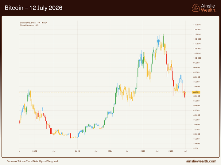
On the Bitcoin chart itself, price is trading around US$64,000, still in the sixties and still hanging on well below the highs. What matters on this chart is not the closing print, it is the colour of the candles. On the Biyond model, yellow and red candles are telling us this is still a bearish regime. Earlier in the year we did see some blue candles as price ran into the low 80s, and plenty of people took that as the all clear. We chose to ignore those on the basis of the liquidity fundamentals underneath, and that call has proven correct. Since then the candles have flipped back to yellow and red, and price has drifted lower, exactly the behaviour a late cycle Bitcoin should show while GLI momentum rolls.
The point is not to predict the exact path, it is to be honest about the fuel. The macro is not supplying the kind of liquidity impulse that drives a sustained breakout from here, so even if we grind higher into a counter trend rally, the ceiling is capped. Bitcoin is probably going to be in the sixties or lower again next month, and being 50% down from an all time high has historically been a pretty good place to start quietly buying. Not all in, just start.
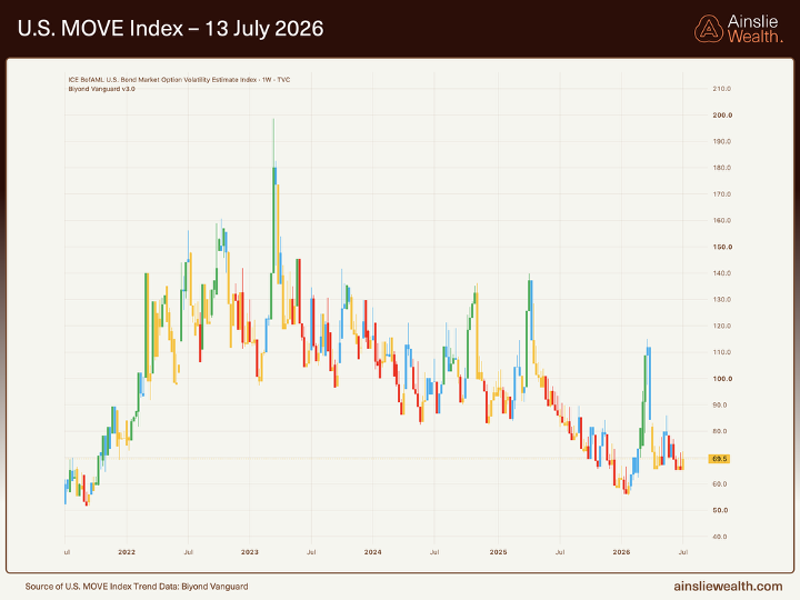
The MOVE index is again the chart we want everyone to pay attention to this month. It sits around 69.5, in line with last month, and that is not an accident. The recent work makes the point pretty bluntly. A ten point move in MOVE is worth around US$2 to 3 trillion of global liquidity, which is roughly a 1.5 percent swing in the GLI. Suppressing this index is therefore doing serious work in the background even while the headlines look benign. The way that suppression is happening is not one big bazooka, it is quiet plumbing.
The Fed ended quantitative tightening on December 1 last year and then, on December 12, kicked off its Reserve Management Program, buying Treasury bills at a starting pace of US$40 billion a month. That is the program that has been holding volatility down since. What has changed recently is the pace. The RMP is still running, but the monthly purchase size has been tapered down through the year, from US$40 billion at the start, to around US$25 billion by April, to roughly US$10 billion at the latest read. So the tap is not shut, it has been turned down to roughly a third of where it started. That combination, program still running but running slower, is exactly what has let MOVE drift sideways rather than compress further.
Add to that the roughly US$600 billion of front-end support that has been injected since the program kicked off in December, and the picture gets clearer. The pipes are being kept just wet enough. Bank reserves in the system are now hovering around US$3 trillion, which by the Fed’s own research sits right around what they define as the ample level, not comfortably above it. That is not the same as saying intervention is imminent, and we are not going to say that, because you can sit near ample for a long time. What it does say is that the buffer between calm plumbing and stressed plumbing is thinner than it was a year ago, and any material funding shock from here will show up in MOVE and in cross currency basis before it shows up anywhere else. That is why we keep this chart at the front of the report.
Macro Indicators
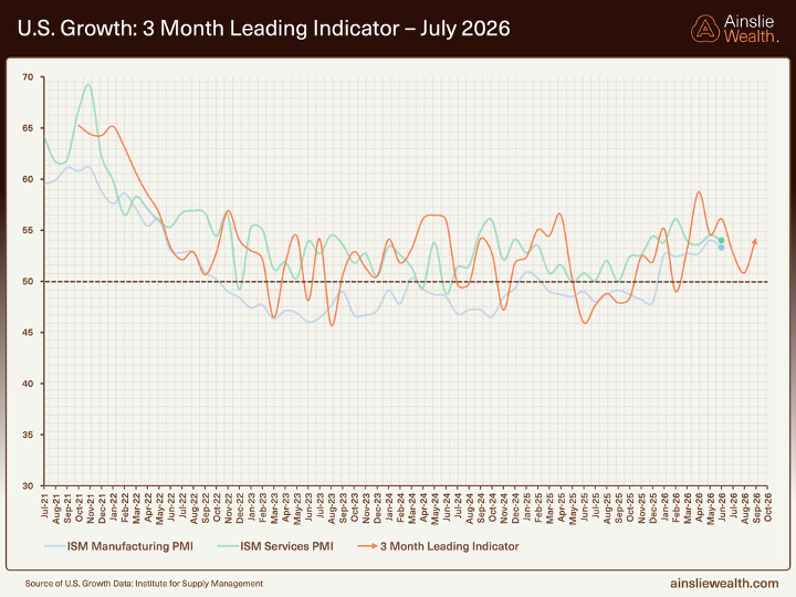
Our 3 month leading indicator on US growth has moved slightly higher this month. The composite is still above the 50 breakeven line, so we are not calling recession, but the shape of the line has turned choppy and is struggling to break higher. That is the signature of a late cycle expansion that is losing altitude, not one accelerating. Growth is still there. It is grinding, not surging. The ISM Manufacturing print at 53.3 for June fits that read, and matches what the leading indicator has been sketching for a few months now.
This is exactly what we expect to see late in a liquidity cycle. The US economy is being propped up by deficit spending and the AI build-out, both of which need ever larger doses of stimulus to keep the print above 50. When you line that up against a 60 to 65 month liquidity cycle that should be rolling over right about now sometime in 2026. None of this is a crash call for the real economy, it is a warning that the growth engine is running on borrowed fuel and the fuel gauge has started to tick down.
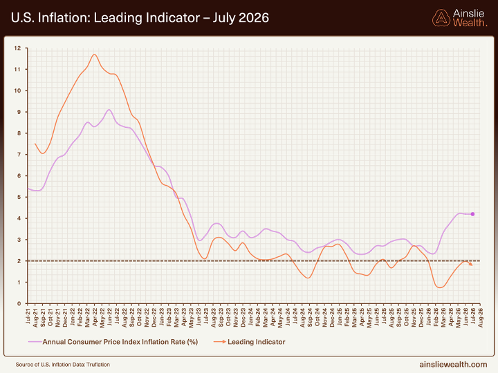
The Truflation leading indicator continues to point lower over the next few quarters, and this month the headline data has actually caught up with it. June CPI came in at minus 0.4% month on month and 3.5% year on year, down from 4.2% in the May print. Core CPI printed flat on the month and 2.6% year on year, down from 2.9%. Energy did the heavy lifting on the downside with a 5.7% fall, but the softness was broad enough to trigger a decent bond rally on the day of release.
Underneath all of this, the deflationary forces are still doing their work. AI-driven productivity gains, white-collar repricing, and ongoing cost-cutting are quietly stripping cost out of the system. But the recent modelling flags a nominal GDP based fair value for the US 10 year yield closer to 6%, against the 4.5% the market is actually paying. That gap is what Walsh at the Fed appears to be responding to. If he really is the hard money man the market thinks he is, the pivot most people are waiting for is coming later and smaller than they expect, and the risk to bond yields is up, not down.
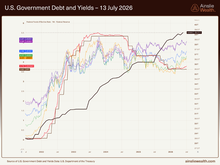
US government debt sits north of US$39 trillion. The last trillion was added in about 6 months, and the current run rate is somewhere around US$5 billion a day. That is a fresh trillion every six months or so, and there is no meaningful political appetite anywhere to slow that down. Yields have played along, with the curve doing exactly what a bear flattener looks like. The 2 year sits around 4.21 percent and is climbing, the 10 year around 4.54 percent, and the 30 year around 5.08 percent.
The 2 year is the one to watch closely. It leads the Fed, not the other way around, and its steady climb this year tells you the bond market is quietly repricing higher for longer. In our view the bond market is now setting the price of rates, not the Fed, and the Fed is going to be dragged into playing catch up rather than leading. The 10 year at 4.54 percent is still trading well below what the modelling suggests is fair value on a nominal GDP basis, which is closer to 6 percent. That gap gets closed one of two ways, either yields drift higher into that fair value, or nominal growth rolls over hard toward the yield. Neither of those is a great outcome for risk assets in the near term, which is one more reason the base case here is patience.
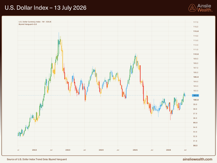
The US dollar is still the swing factor for global liquidity, and it is still doing the heavy lifting on the nominal numbers. The DXY is trading around 100 to 101, sitting right on the level and quietly refusing to break lower. It is choppy sideways rather than a clean trend, but the fact that it is holding this floor while the Fed looks the most hawkish it has in years is telling. A firmer dollar is a headwind for the weekly nominal liquidity chart, for Emerging Market risk, and for Bitcoin.
That is either the calm before something nasty, or a sign that the dollar has quietly peaked in cyclical terms. The levels to watch are simple. To the upside, the first line in the sand is 102, which has capped every rally attempt in the last year. If DXY breaks and holds above 102, the next real ceiling is 105, and beyond that you are looking at the 110 area from the last cycle high. A break through 102 and into that 102 to 105 zone would be the air pocket scenario for global liquidity, EM risk, and Bitcoin. To the downside, the level we care about is 99. Lose 99 on a weekly close and the whole late cycle dollar strength narrative starts to unwind, which would be the proper tailwind for the rest of the year. Right now, on balance, we lean to the firmer dollar side as global liquidity is forecasted to deteriorate.
The Bigger Picture
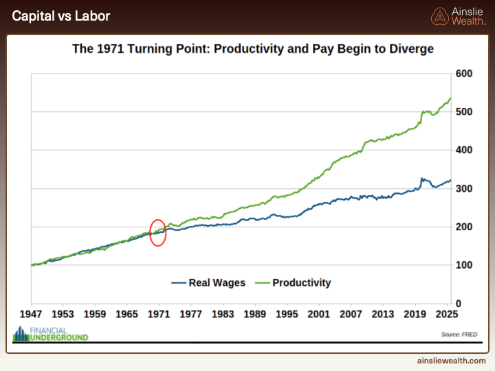
It is easy to get lost in the monthly numbers, so it is worth zooming right out. This chart shows US productivity and real wages growing together right up until 1971, when Nixon closed the gold window, and then diverging violently. Productivity kept climbing, real wages did not. Everything above that green line since 1971 has accrued to owners of assets, not to owners of labour. If you are betting on wage growth to get you ahead, you are running the wrong strategy, because 4 percent inflation indexed pay rise, after tax, cannot possibly keep up with assets that inherently price against monetary inflation.
It is also worth being blunt about what this chart is really telling you. The last 54 years have not been a story of workers being paid less for what they do. Productivity has risen. What has changed is who captures the upside of that productivity. Since 1971, the entire delta between the green line and the blue line has been captured by the owners of the balance sheet, so equities, real estate, and increasingly Bitcoin. The system rewards ownership of scarce assets funded with a currency that is not scarce, and it punishes labour paid in that same currency. Once you see it you cannot unsee it. Every serious wealth building plan from this point forward has to start by getting on the correct side of that chart, which means owning assets and, ideally, owning the hardest asset in the set.
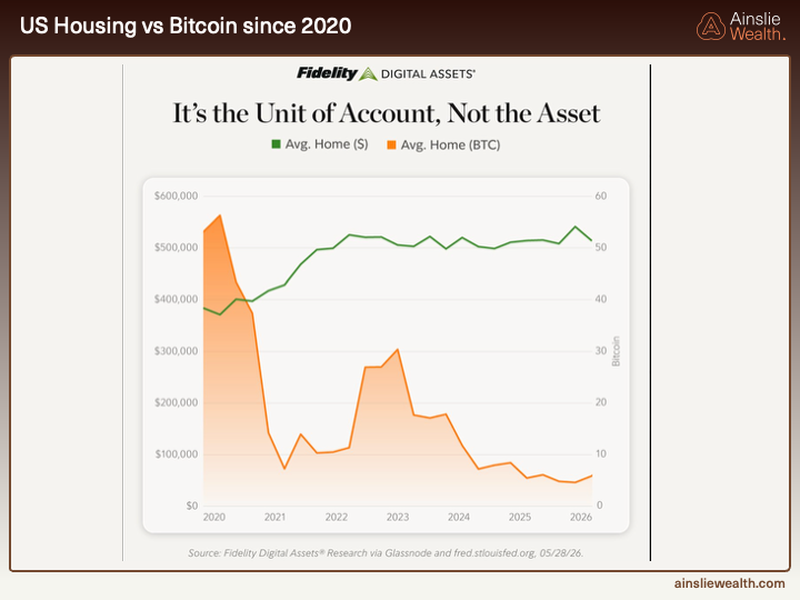
This chart puts a sharper point on it. It shows the average US home priced two ways since 2020. In dollars the line is flat around US$500,000, drifting a bit higher. In Bitcoin the line has collapsed from over 50 BTC in 2020 to under 10 BTC today. Same house, wildly different story depending on the unit of account you choose. That is exactly the point. It is not really the asset, it is the yardstick.
You cannot live in your Bitcoin, and volatility on that orange line is real. But if you are trying to save up for a house over a four or five year window, a well timed accumulation into Bitcoin lows has historically closed the deposit gap faster than saving in dollars ever could. Every year that a first home buyer waits, the deposit target climbs by a few percent, and cash in an offset does not close that gap. Bitcoin does, with volatility and patience attached. Owning assets is how you outrun the wage line above.
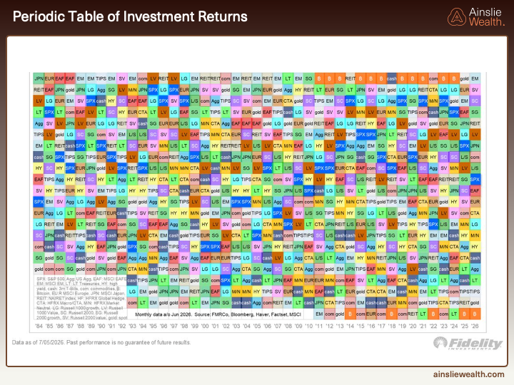
This is the Fidelity Periodic Table of Investment Returns going back to 1984. Each column is one year, each square is an asset class, best performers at the top and worst at the bottom. Bitcoin has only been in the sample from around 2011, and in that time it has done exactly one of two things. It has finished the year in first place, or it has finished the year in last place. There is almost nothing in between. Right now, mid way through 2026, Bitcoin is sitting at the bottom again.
That is not a reason to sell, it is a reason to pay attention. The historical pattern is that Bitcoin at the bottom of this table is followed, sooner rather than later, by Bitcoin at the top of this table. If the liquidity picture plays out the way the modelling suggests, with a proper trough somewhere in 2027, then 2027 is a very reasonable candidate for another number one row. The point is not to time it to the week, the point is that being early to accumulate when the asset is at the bottom is what makes the outsized returns available. Buying at the top of the table can still work. There are clear years where Bitcoin has printed first place and then stayed near the top the following year while the cycle ran hot. But that is a very different trade. That is momentum trading a cycle that is already going, with much smaller asymmetry and much less room for error. Buying at the bottom is where the risk reward is properly skewed in your favour, and that is where we are right now.
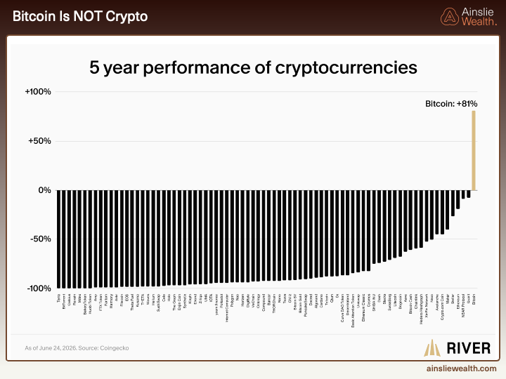
This last chart is the one that should end the conversation about altcoins. It shows the 5 year performance of the top listed cryptocurrencies. Bitcoin is up around 81%. Almost everything else is down 50%, 75%, or outright dead. This is not a case of picking the wrong ones, this is the entire distribution. The survival rate of altcoins is brutal, and for every one that actually performs, hundreds of them end up somewhere to the left of Bitcoin on this chart, which is to say, worthless.
Bitcoin is not crypto. It is monetary technology with a fifteen year track record, a fixed supply, and a framework we can actually model against global liquidity. Everything else on this chart is a speculation on hype cycles and news flow, and hype cycles do not compound. We have a framework of liquidity that works fairly well for Bitcoin, and there is no equivalent framework for any of the rest. If you want good long term risk reward, you stick with the blue chip. There is one.
Conclusion
Pulling all of this together, the story of July is not that anything blew up. It is that the framework we keep hammering on kept doing what it was supposed to do. The single most useful chart in this month’s report is the Central Bank Policy Heat Map. It is almost entirely orange and yellow across the Advanced Economies, with only around 16 percent of them actually easing on a liquidity basis. That is the punchline. There is no underlying support coming from the people who normally supply it. The Bank of Japan is not stepping in, the Fed is still leaning restrictive, and the potential incoming Fed Chair is being modelled on Volcker rather than a dove. Nominal liquidity keeps printing new highs, and every month we have to explain again why that number is misleading. The monthly Global Liquidity Index has rolled from 57 to 40, the Shadow Monetary Base is contracting, MOVE is only calm because the Fed is quietly working the pipes with US$600 billion of plumbing, and hyperscaler capex is now eating close to 100 percent of operating cash flow. On the labels the recent work uses, we are in Speculation and the next phase is Turbulence. Everything on the heat map tells you the same thing. The support is not there.
For Bitcoin specifically, none of this changes the long term view. We are still bulls, and we will still be bulls when the next cycle rips. What we are flagging is that the next six to twelve months are most likely a grind. Sideways with a downward bias remains the base case, with the proper opportunity setting up into a liquidity trough somewhere in 2027. At the current price Bitcoin is not expensive, and on a four year plus horizon almost any entry around here works out fine. That is not the same as saying you should be aggressive today. You will very likely get a better entry, and this is the environment where dollar cost averaging and boring, disciplined accumulation do the heavy lifting for the next cycle.
We are watching for catalysts that would force the Fed to step up support before that 2027 trough arrives, whether a funding squeeze, a disorderly move in bonds, a deeper rollover in growth and employment, or something we have not thought of yet. However, but the charts do not justify trading as if the cavalry has already arrived. For now we are in a late cycle environment with clear liquidity headwinds, a still growing but choppy real economy, and a Bitcoin price that has moved well ahead of the deterioration we can actually see in the data. Even after all of that, and this is the point we want to leave you with, Bitcoin remains the single best risk reward asset on the board for patient capital. Nothing else has the same fixed supply, the same framework that we can model against liquidity, or the same asymmetry into the next cycle. The homework this month is to sit tight, keep stacking on weakness, and let the next liquidity turn do the heavy lifting.
Watch the full presentation with detailed explanations and discussion on our YouTube Channel here: https://www.youtube.com/watch?v=8KqgVGtV22M
Until we return with more analysis next month, keep stacking those sats!
Joseph Brombal
Research and Analysis Manager
The Ainslie Group
x.com/Packin_Sats
Share this Article:
Crypto in your SMSF





Get Started Trading Crypto with Ainslie.
Join Thousands of satisfied customers who trust Ainslie for their cryptocurrency and bullion needs.